
How Ancient Maps Were Made: Five Surprising Truths About Cartography
Before you had a GPS in your pocket, creating a map was a complex art. This is a look into the forgotten world of cartography, revealing challenges and solutions behind the maps that shaped our world.

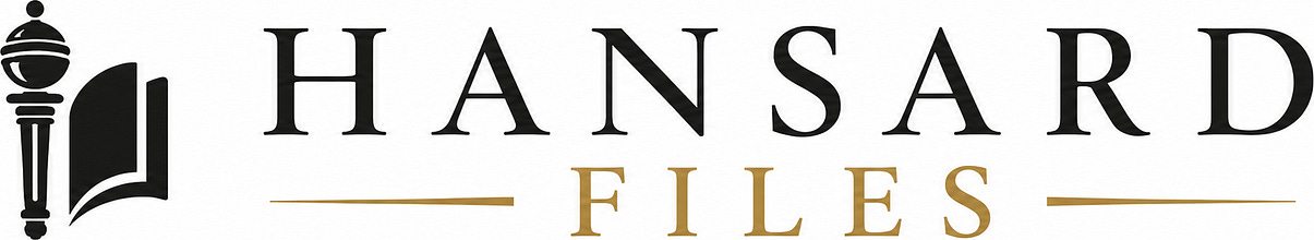
Have you ever stopped to think about the map on your phone? With a few taps, you see the entire globe, zoom in on your street, and get directions to anywhere. We take this incredible technology for granted. But the journey to create an accurate picture of our world was long, filled with brilliant minds and surprising challenges. A 1965 report from the Geological Survey of Canada provides a unique window into this manual and meticulous era of map-making.
The principles discovered and the problems solved by these early cartographers still form the foundation of how you navigate your world today. The report shows that creating a useful map required a blend of art, science, and difficult choices. What follows are some of the most impactful takeaways from a time when maps were painstakingly drawn by hand, long before satellites and software.
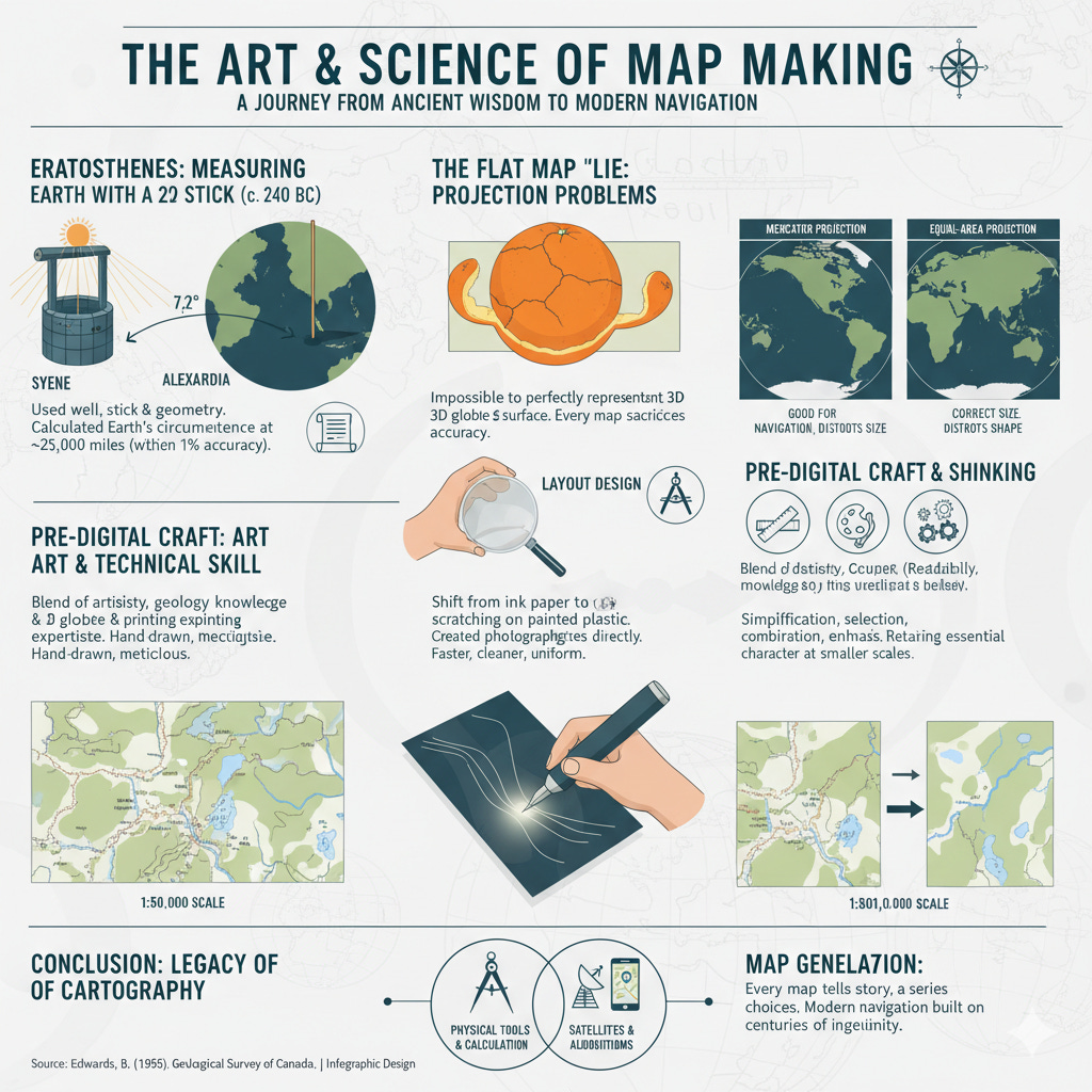
An Ancient Librarian Measured the Earth Using a Well and a Stick
Long before space travel gave us a picture of our planet, a Greek mathematician and philosopher named Eratosthenes calculated the Earth's circumference with stunning accuracy. His tools were simple: a deep well, a vertical pole, and his own reasoning.
Eratosthenes, who was the librarian in the famous library of Alexandria, Egypt, learned of a deep well in the town of Syene. At noon on the summer solstice, the longest day of the year, the sun's rays shone directly down the well, completely illuminating its bottom. This meant the sun was directly overhead. At that exact same time in Alexandria, some 500 miles north, he observed that a vertical pole cast a shadow.
He correctly deduced that the shadow was a result of the Earth’s curvature. By measuring the angle of the shadow, he found it was 7 1/5 degrees, or 1/50th of a full 360-degree circle. Using simple geometry, he knew this angle was the same as the angle between the two cities if lines were drawn to the Earth's centre. If 500 miles was 1/50th of the planet's total circumference, then the full distance must be 50 times that. His calculation was 25,000 miles. The correct measurement is about 24,860 miles. This incredible feat, performed over two thousand years ago, gave map-makers the foundational data they needed to begin creating an orderly system for mapping the world.
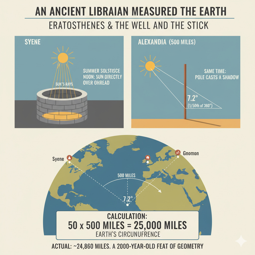
Every Flat Map of the World Is a Lie
It is impossible to show a true picture of a round world on a flat piece of paper without distorting it in some way. This is the fundamental and unavoidable problem that has challenged cartographers for centuries. Every map projection, which is the system of parallels and meridians a map is drawn on, must sacrifice something. You simply cannot make a portion of a sphere lie flat without some stretching or squishing.
A map is either 'equal-area', where the size of landmasses is correct relative to each other, or 'conformal', where the local shapes of those landmasses are correct. You cannot have both.
A projection which is good for Canada is not necessarily good for Africa (due to different land mass shapes), and a different projection is used for a navigational chart than for a statistical map. Every projection has certain virtues and certain limitations.
The most famous example of this distortion is the Mercator projection, which was devised in 1569 for navigation. On this map, Greenland appears to have the same area as South America. In reality, South America is nearly ten times larger. The Mercator projection preserves angles and local shapes, making it excellent for sailing, but it massively distorts the size of landmasses as you move further from the equator. This shows the compromises map-makers must make.
Map-Making Was a Demanding Artistic and Technical Skill
Before computer-aided design, a geological draughtsman needed a unique combination of skills. While the rise of stick-up lettering and scribing made pure penmanship less critical, it was still essential for many tasks like creating illustrations, three-dimensional diagrams, and sketch-maps.
A cartographer needed to be an expert in design with three key attributes:
Layout Design: Every map had to be functional, easy to read, and economical. Wasted space on a map was wasted money in printing.
Colour Design: The ability to choose colours was a vital skill. Colours needed to be functional and easy on the eye, helping the user interpret the map's information correctly.
Conceptual Design: A great draughtsman could grasp a geologist's abstract ideas and translate them into a clear, effective diagram.
Beyond artistry, the job was deeply technical. A cartographer had to know enough geology to correctly interpret field notes and generalize information to fit the map's scale. They also needed a working knowledge of printing methods to understand the limitations and tolerances of the final product.
Before Digital Tools, Map-Makers Scratched on Painted Plastic
For generations, the final map was a drawing made with black ink on metal-mounted paper. This process was filled with challenges. The paper had to be submerged in water to print the blue-line base copy, which damaged the surface texture and made it difficult to apply ink evenly. Draftsmen became highly skilled in sharpening pens, maintaining ink consistency, and dealing with atmospheric humidity, all of which affected the final line quality.
In the mid-20th century, a new technique called scribing changed everything. Instead of drawing with ink, cartographers worked on transparent plastic sheets coated with an opaque paint. Using specialized tools like rigid and swivel scribers, they would carefully cut away the paint, creating sharp, clean lines.
This process essentially created a photographic negative directly. It was faster, produced a more uniform line from map to map, and resulted in a higher quality product that did not require major retouching. This shift from ink to scribing was a major technological leap that solved many of the persistent problems of traditional drafting.
Making a Smaller Map Involves More Than Just Shrinking It
When you reduce the scale of a map, you cannot simply shrink all the details proportionally. This process, known as generalization, is a critical part of cartography that requires selection, judgment, and the retention of essential elements.
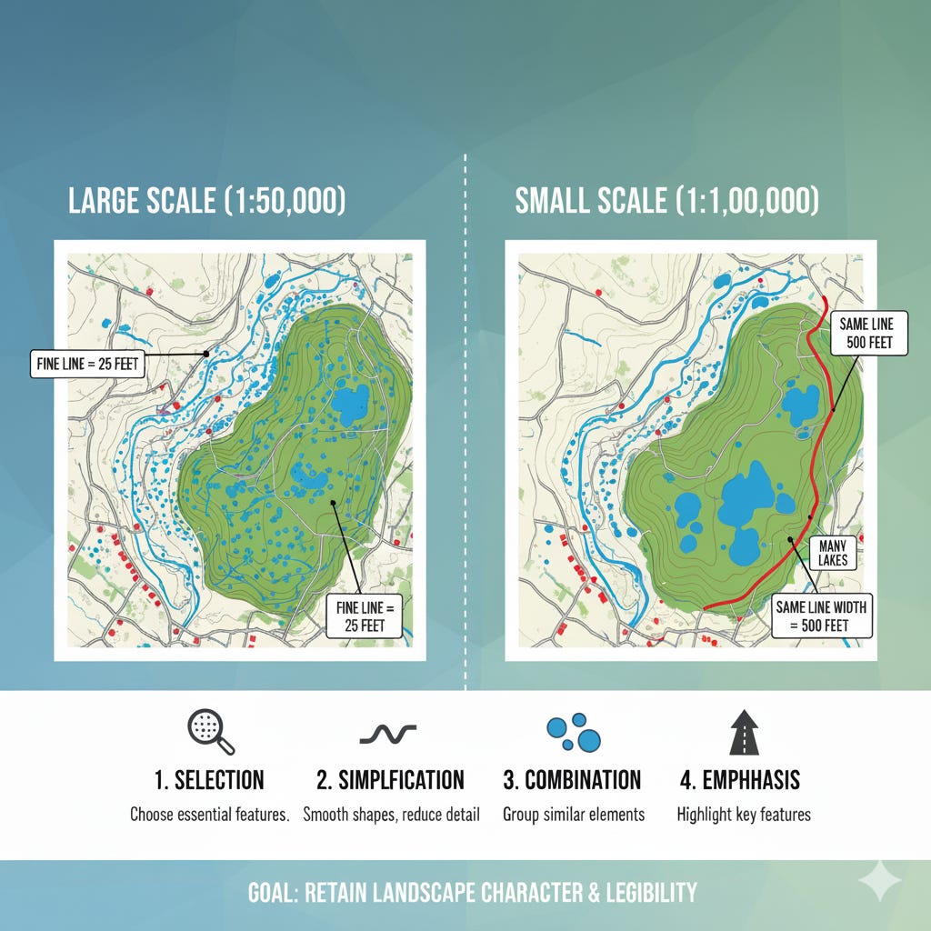
As the scale decreases, the lines used to draw objects take up a proportionally larger amount of space. For example, at a 1:50,000 scale, a fine line represents a distance of 25 feet on the ground. At a 1:1,000,000 scale, that same line width covers 500 feet. Details must be omitted because showing them would require magnifying them to an impractical degree.
A cartographer must make careful choices:
Selection: Choosing which features best represent the area's characteristics.
Simplification: Smoothing out small bays or irregular shorelines to avoid a confusing depiction.
Combination: Grouping small, dense features into a single symbol or outline.
Emphasis: Magnifying or displacing certain features, like roads or buildings, to ensure they remain visible and the map stays clear.
The goal is to maintain the essential character of the landscape. A region of many small, glacial lakes should still look that way on a smaller scale map, even if many individual lakes are omitted or combined. This careful simplification ensures the map remains legible and useful.
The world of mid-century cartography reveals a field of immense skill and ingenuity. These map-makers, working with physical tools and complex calculations, laid the groundwork for the effortless navigation you use today. Their work reminds us that every map is a construction, a set of choices made to tell a specific story about the world.
While the technology has advanced from ruling pens and scribing tools to satellites and algorithms, the core challenge remains the same: how to represent a complex, three-dimensional world on a two-dimensional surface. The next time you chart a route on your screen, consider the centuries of thought, artistry, and compromise that make your journey possible. What hidden generalizations and distortions are shaping your view of the world?
Sources:
Edwards, B. (1965). A collection of cartographic notes (Topical Report No. 108). Geological Survey of Canada.